This is a parameterized report that showcases the benefits of reproducing analysis at the click of a button.
It makes it very easy to update any work and alter any input parameters within the report.
This report is adaptable to the 4 semifinalists of the Euro 2024: Spain, France, England, Netherlands.
Code
# Parameters are set in yaml header and retrieved heremy_teams <-tibble(code =c(params$code_a, params$code_b),fullname =c(params$fullname_a, params$fullname_b))# # Same as# my_teams <-# tibble(# code = c("ESP", "ENG"),# fullname = c("Spain", "England"))
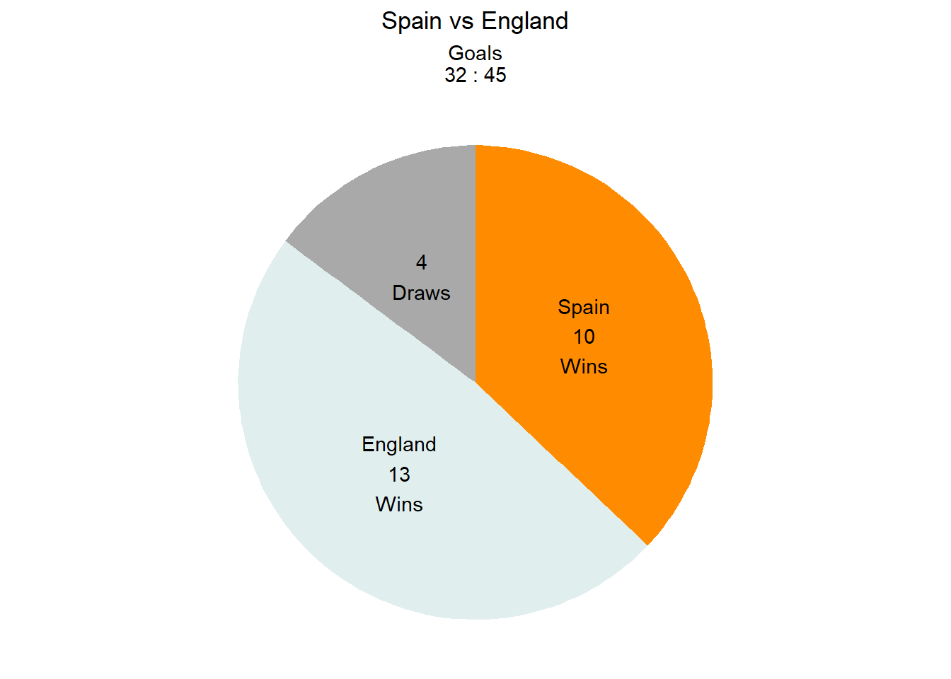
Quantitative Comparison of Spain vs England
The clash between Spain and England in the Euro 2024 final is set to be a thrilling and highly anticipated match. Check out this quantitative comparison between the two teams.
Both teams have a storied history. Their first match ever played was a Friendly match in 1929 in the city of Madrid: Spain vs England 4:3.
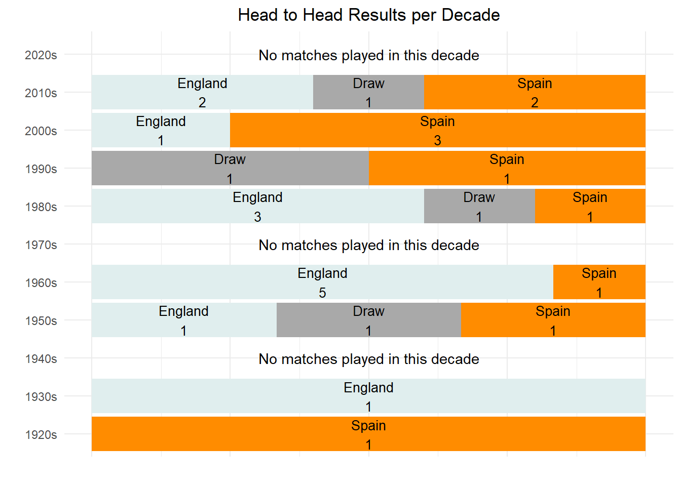
Here is their head to head performance since then.
Code
# Compute score to introduce in chart subtitlescore_head_to_head <- matches_head_to_head %>%group_by(team, team_against) %>%summarize(score_sum =sum(score),score_against_sum =sum(score_against)) %>%ungroup()decades <-seq(min(year(matches_head_to_head$date)) %/%10*10, 2020, 10)plot_data <- matches_head_to_head %>%group_by(decade =year(date) %/%10*10, winner) %>%count() %>%ungroup() %>%# Introduce n=0 for all decades present in the data (where matches were played)complete(decade, winner, fill =list(n =0)) %>%# Make sure to introduce also decades where no matches where playedmutate(decade =factor(decade, levels = decades)) %>%complete(decade)# Pie chartpie_chart_data <- plot_data %>%filter(!is.na(winner)) %>%group_by(winner) %>%summarise(n =sum(n))# Compute the position of labels for pie chartpie_chart_data_y_pos <- pie_chart_data %>%arrange(desc(winner)) %>%mutate(prop = n /sum(pie_chart_data$n) *100) %>%mutate(ypos =cumsum(prop) -0.5* prop)color_values <-c("darkorange", "darkgrey", "azure2")names(color_values) <-c(my_teams[[1, 2]], "Draw", my_teams[[2, 2]])pie_chart_data_y_pos %>%ggplot(aes(x ="", y = prop , fill = winner)) +geom_bar(stat ="identity", width =1) +coord_polar("y") +theme_void() +theme(legend.position ="none") +geom_text(aes(y = ypos, label =if_else(winner !="Draw", paste0(winner, "\n", n, "\n", "Wins"), paste0(n, "\n", winner, "s")))) +labs(title =paste0(score_head_to_head[[1,1]], " vs ", score_head_to_head[[1,2]]),subtitle =paste0("Goals\n", score_head_to_head[[1,3]], " : ", score_head_to_head[[1,4]])) +theme(plot.title =element_text(hjust =0.5),plot.subtitle =element_text(hjust =0.5)) +scale_fill_manual(values = color_values)
England won 3 matches more than Spain. These date back to the 1960s, when England won its only championship to date. Since then, the performance has been very even, with a slight advantage in favour of Spain.
Code
plot_data_no_matches <- plot_data %>%filter(is.na(winner)) %>%mutate(text ="No matches played in this decade")plot_data %>%filter(n !=0) %>%mutate(winner =fct_relevel(winner, c(my_teams[[1, 2]], "Draw", my_teams[[2, 2]]))) %>%ggplot(aes(x =paste0(decade, "s"), y = n, fill = winner)) +geom_col(position ="fill") +geom_text(aes(label =paste0(winner, "\n", n)),position =position_fill(vjust =0.5),size =3.5) +geom_text(data = plot_data_no_matches, aes(x =paste0(decade, "s"), y =0.5, label = text)) +labs(x ="",y ="",title ="Head to Head Results per Decade") +theme_minimal() +theme(legend.position ="none",plot.title =element_text(hjust =0.5),plot.subtitle =element_text(hjust =0.5),axis.text.x =element_blank(),axis.ticks.x =element_blank()) +coord_flip() +scale_fill_manual(values = color_values)
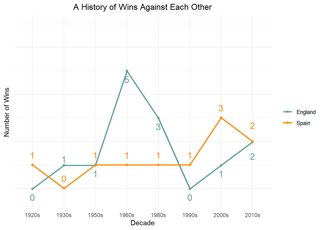
The history of wins illustrates this.
Code
# Change "azure2"-color value of line chart for better visibilityline_color_values <-c("darkorange", "darkgrey", "cadetblue")names(line_color_values) <-c(my_teams[[1, 2]], "Draw", my_teams[[2, 2]])plot_data %>%filter(winner !="Draw") %>%ggplot(aes(x =paste0(decade, "s"),# Offset lines to avoid overlappingy =if_else(winner == my_teams[[1, 2]], n +0.01, n -0.01),color = winner,group = winner)) +geom_line(position = , linewidth =1) +geom_point() +geom_text_repel(aes(label = n,# Offset text team 1 above and team 2 below linevjust =if_else(winner == my_teams[[1, 2]], -1, 1.75)),size =5,# To suppress the line joining label to pointsegment.color =NA,show.legend =FALSE) +labs(x ="Decade",y ="Number of Wins",color ="",title ="A History of Wins Against Each Other") +scale_y_continuous(limits =c(-0.5, max(plot_data$n, na.rm = T) +2)) +theme_minimal() +theme(plot.title =element_text(hjust =0.5),plot.subtitle =element_text(hjust =0.5),axis.text.y =element_blank(),axis.ticks.y =element_blank()) +scale_color_manual(values = line_color_values)
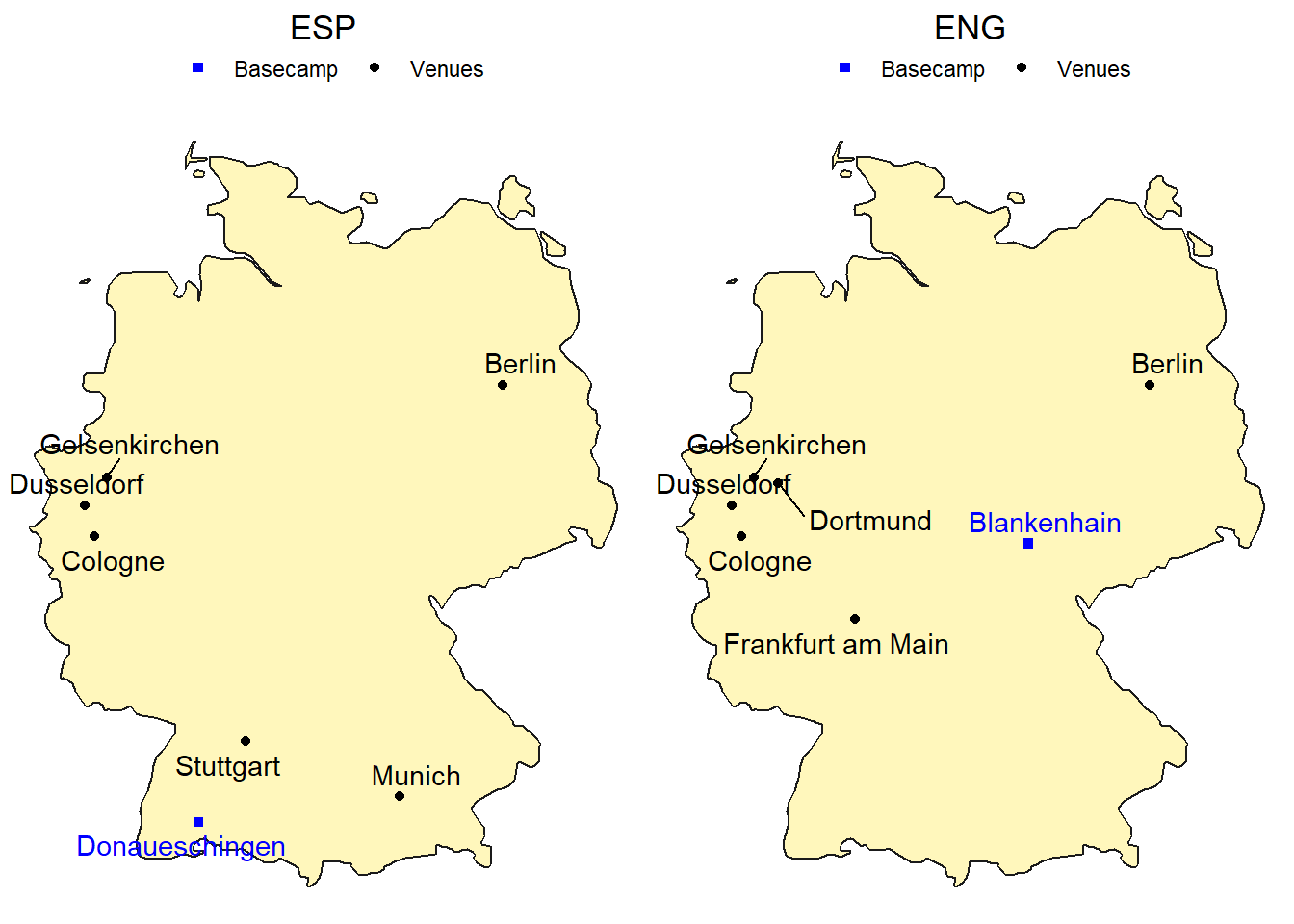
Mapping the Journey
Back to the present, here are the teams’ venues and training camps across the Euro 2024.
Code
# Write function for plottingplot_team_journey <-function(team, show_legend =TRUE) { match_data <- euro_2024_matches %>%filter(home_team_code == team | away_team_code == team) %>%# since we use geom_text_repel() a city would be plotted twice in different positionsdistinct(stadium_city, .keep_all =TRUE) basecamp_data <-filter(basecamps, team_code == team)ggplot() +# Plot German map with map package datageom_polygon(data = germany,aes(x = long, y = lat, group = group),colour ="grey10", fill ="#fff7bc") +geom_point(data = match_data,aes(x = stadium_longitude, y = stadium_latitude, color ="Venues")) +geom_point(data = basecamp_data,aes(x = long, y = lat, color ="Basecamp"), shape =15) +geom_text_repel(data = basecamp_data,aes(label = basecamp, x = long, y = lat, color ="Basecamp"),show.legend =FALSE) +geom_text_repel(data = match_data,aes(label = stadium_city, x = stadium_longitude, y = stadium_latitude, color ="Venues"),show.legend =FALSE) +scale_color_manual(name ="",values =c("Venues"="black", "Basecamp"="blue")) +theme_void() +# Use paste() function to enquote team variableggtitle(paste0(team)) +theme(plot.title =element_text(hjust =0.5),legend.position ="top")}# Show both plots in the same panegrid.arrange(plot_team_journey(my_teams$code[1]),plot_team_journey(my_teams$code[2]),ncol =2)
Descriptive Analytics
Code
euro_2024_matches_pivoted <- euro_2024_matches %>%filter(date < params$match_day) %>%select(id_match, starts_with("home"), starts_with("away")) %>%pivot_longer(# pivot all columns except id_matchcols =-id_match,# split into multiple columns names_to =c("Location", # receives the values "home" or "away"".value"), # the remaining part of the column names should become the names of the new columnsnames_pattern ="(home|away)_(.*)") # how to split into multiple columns (".*" matches the ".value" from before)euro_2024_matches_pivoted_joined <- euro_2024_matches_pivoted %>%left_join(euro_2024_matches_pivoted,join_by(id_match),suffix =c("", "_against"),# set relationship to silence the warningrelationship ="many-to-many") %>%filter(team != team_against)
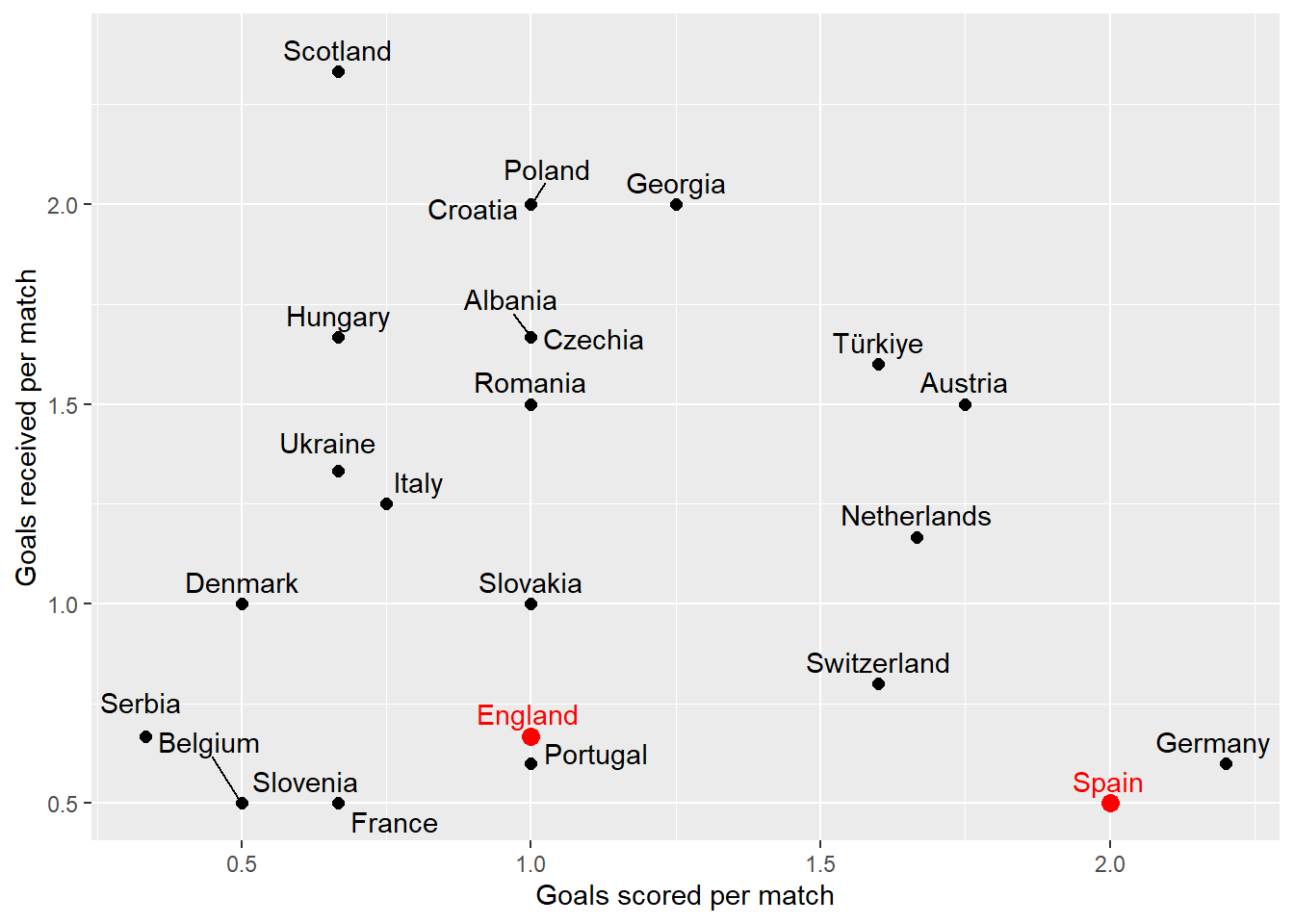
Scoring dynamics: comparing the number of goals scored and received by each team throughout the current tournament.
Code
euro_2024_matches_pivoted_joined_goal_summary <- euro_2024_matches_pivoted_joined %>%filter(!is.na(score)) %>%group_by(Team = team) %>%# group_by() and renamesummarise(`Matches played`=n(),`Goals scored`=sum(score),`Goals received`=sum(score_against),`Goals scored per match`=mean(score),`Goals received per match`=mean(score_against))euro_2024_matches_pivoted_joined_goal_summary %>%select(1:4) %>%filter(Team %in%c(my_teams$fullname)) %>%kable()
Team
Matches played
Goals scored
Goals received
England
6
6
4
Spain
6
12
3
Let’s put this performance in visual relation to all other teams.
Code
euro_2024_matches_pivoted_joined_goal_summary %>%ggplot(aes(x =`Goals scored per match`,y =`Goals received per match`)) +geom_point(aes(colour = Team %in%c(my_teams$fullname),size = Team %in%c(my_teams$fullname))) +geom_text_repel(aes(label = Team,colour = Team %in%c(my_teams$fullname)),nudge_y = .05) +scale_size_manual(values =c(2, 3)) +scale_color_manual(values =c("black", "red")) +theme(legend.position ="none")
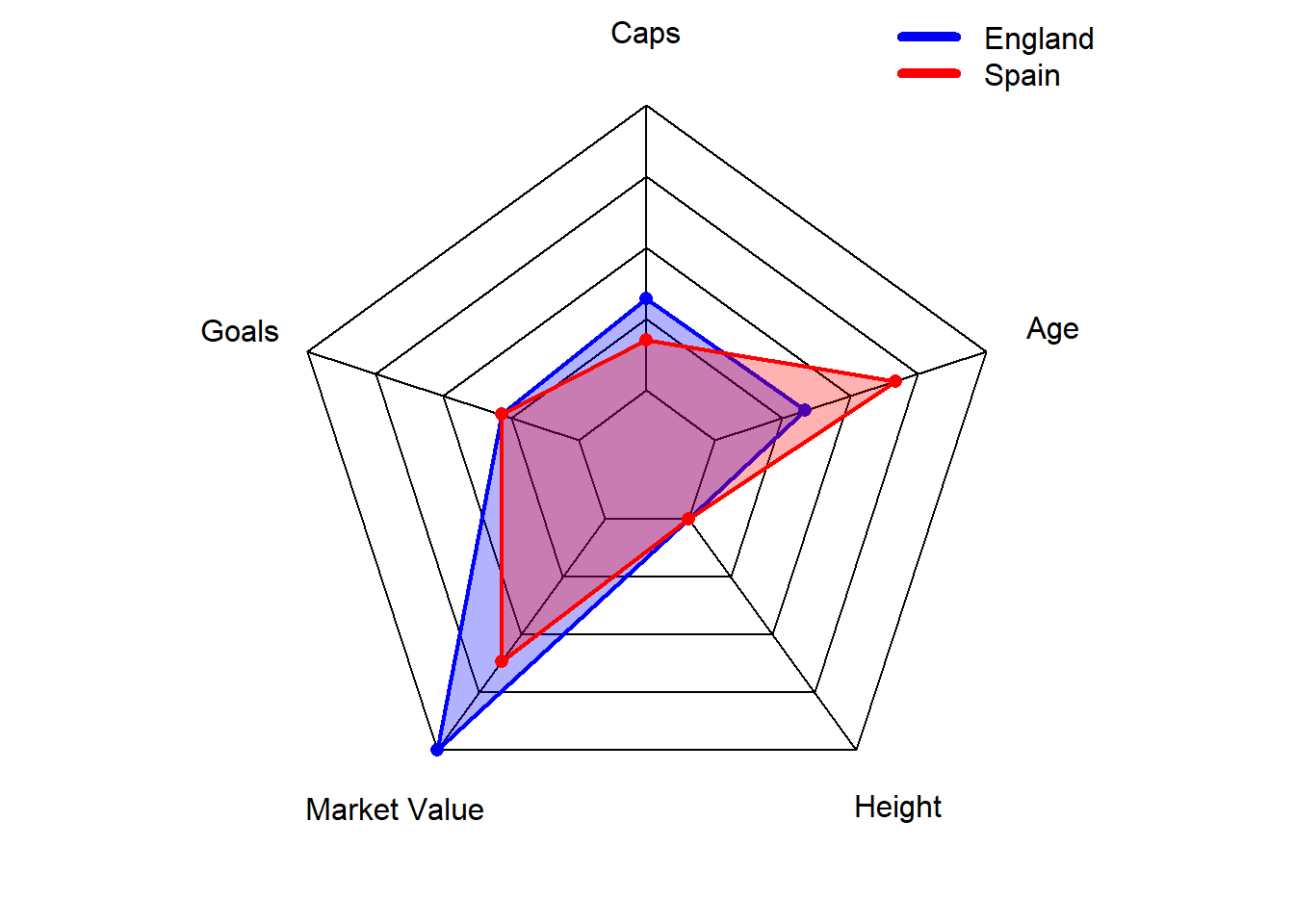
Inside the teams: what are their strengths and weaknesses?
For each team, we look at the average per player of
International appearances (caps): reflecting a player’s experience and consistency at the international level.
Goals (in international matches): indicating a team’s offensive capability.
Market value: providing insight into each player’s perceived worth based on market demand.
Height: a strategic factor that was highlighted by former German national keeper Jens Lehmann as a disadvantage for Spain’s team before playing against Germany. Spain won anyways, so how much does height really matter when comparing two teams?
Age: indicating the balance between youthful energy and veteran experience.
# Write function to bind_rows regardless of column names# Thanks to https://exploratory.io/note/kanaugust/How-to-Force-Merging-Rows-Ignoring-Columns-Names-xpI8bqI4Tmforce_bind <-function(tbl1, tbl2) {colnames(tbl2) =colnames(tbl1)bind_rows(tbl1, tbl2)}euro_2024_players_summary_filtered <- euro_2024_players_summary %>%filter(Country %in% my_teams$fullname)radarchart_data <- euro_2024_players_summary_filtered %>%force_bind( euro_2024_players_summary %>%summarise("0_max", # For sorting latermax(avg_caps),max(avg_goals),max(avg_value),max(avg_height),max(avg_age))) %>%force_bind( euro_2024_players_summary %>%summarise("1_min", # For sorting latermin(avg_caps),min(avg_goals),min(avg_value),min(avg_height),min(avg_age))) %>%# arrange() to get maximum values as row 1 and minimum values as row 2arrange(Country) %>%select(-Country)# Set the plot dimensions (width, height)par(pin =c(5, 5))colours <-c("blue", "red")radarchart_data %>%radarchart(# custom polygonpcol = colours,pfcol =adjustcolor(colours, alpha.f =0.3),plwd =2,plty =1,vlabels=c("Caps", "Goals", "Market Value", "Height", "Age"),# custom the gridcglcol ="#000000",cglty =1,axislabcol ="#000000",cglwd =1 )mtext(paste0(my_teams$fullname, collapse =" vs "), side =3, line =0.5, cex =2, at =0, font =1,col ="#000000")legend("topright",bty ="n", # to avoid a box around the plotlegend = euro_2024_players_summary_filtered$Country, # get values like this to make sure the order corresponds to color valuescol = colours,lty =1,lwd =5)
Player with the most international appearances: Álvaro Morata with 72 Caps.
Player with the most goals scored: Álvaro Morata with 34 Goals.
Player with the highest market value: Rodri with 120 M€ of market value.
England:
Player with the most international appearances: Harry Kane with 91 Caps.
Player with the most goals scored: Harry Kane with 63 Goals.
Player with the highest market value: Jude Bellingham with 180 M€ of market value.
Conclusion
The championship trophy is supposed to be coming home to England. I strongly anticipate it’s not coming home. It’s going to Spain. And it’s going to stay there for the next 4 years.